Debugging motion data
I am currently working on a motion model for a robotics localisation system, more details of which will be in an upcoming book.
While working on it, I’ve been scratching my head (or bashing my head) against confusing motion behaviour for the best part of 4 weeks.
However, I’ve made 2 breakthroughs in the last few days. One of them you’ve seen Geometry and Trigonometry mix ups. The other I am still getting to the bottom of. The poses behave like the robot was driving in little circles!
Motion data?
The robot has a series of guesses on where it will be, in the form of poses. Each pose is a x and y coordinate, plus a heading.
How do you debug motion data?
The robot system in question outputs data wirelessly so it can be plotted in real time with matplotlib. This is just the x and y coordinates, and was showing some strange things happening. Like the robot going in a roughly straight line, and poses going in circles. This meant none of the rest of what I wanted to do with the data made any sense at all.
I was able to dump the extended pose data with raw encoder sensor data, and then that sensor data converted into rotation1, translation, rotation2 form.
I captured this data (copy pasted) from a serial terminal, into a jupyter notebook, and imported matplotlib along with numpy:
Imports:
import numpy as np
from matplotlib import pyplot as plt
Data:
# x, y, theta, left, right, rot1, trans, rot2
data = np.array([
  (1150.09, 192.206, 66.9911, 9, 8, -0.00444137, 0.224023, -0.00444137),
  (1172.14, 244.418, 67.2132, 2138, 2163, 0.111037, 56.6778, 0.111037),
  (1192.47, 292.049, 66.5559, 2002, 1928, -0.328659, 51.7888, -0.328659),
  (1217.07, 347.724, 65.7653, 2354, 2265, -0.395283, 60.8683, -0.395283),
  (1238.91, 395.394, 65.0103, 2032, 1947, -0.377517, 52.4345, -0.377517),
...
])
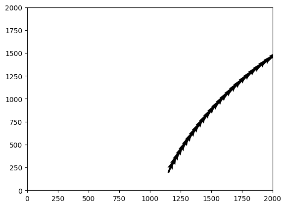
This is just one pose, tracked through time with it’s data. A quiver is like a scatter plot, but with little arrows for a direction (heading) too:
# lets plot the x, y, theta
fig, ax  = plt.subplots()
ax.set_xlim(0, 2000)
ax.set_ylim(0, 2000)
u, v = np.cos(np.radians(new_data[:, 2])), np.sin(np.radians(new_data[:, 2]))
ax.quiver(new_data[:, 0], new_data[:, 1], u, v)
Plotting this yielded what seemed to be sensible.
Hmm, this isn’t going in little circles the way the live data seemed to be. So I grabbed multiple pose data from the output to the matplotlib client:
poses_raw_data = """
  Received data: {"poses": [[1150, 192], [155, 870], [1413, 665], [112, 620], [738, 209], [518, 344], [661, 1441], [1315, 9], [1077, 998], [1433, 197], [957, 729], [589, 569], [1492, 1089], [1345, 61], [982, 258], [385, 1024], [478, 675], [582, 210], [1359, 686], [922, 937]]}
  Received data: {"poses": [[1172, 244], [103, 894], [1363, 693], [124, 675], [789, 184], [551, 298], [713, 1463], [1293, 62], [1068, 943], [1394, 238], [1010, 748], [540, 540], [1490, 1032], [1292, 82], [1036, 243], [352, 978], [508, 626], [639, 212], [1311, 716], [890, 891]]}
...
"""
This data is quite raw, it’s json with some fluff, so I processed it into numpy arrays again:
import json
poses_lines = poses_raw_data.split("\n")
poses_lines = [line.replace("Received data: ", "") for line in poses_lines if line]
poses_dicts = [json.loads(line) for line in poses_lines]
# 3D array = time, pose number, [x, y]
poses_over_time = np.array([poses_dict["poses"] for poses_dict in poses_dicts])
Plotting the first pose over time, I get a plot very similar to the quiver (without the heading):
fig, ax = plt.subplots()
ax.set_xlim(0, 2000)
ax.set_ylim(0, 2000)
# The scatter will be the first pose over time.
ax.scatter(poses_over_time[:, 0, 0], poses_over_time[:, 0, 1])
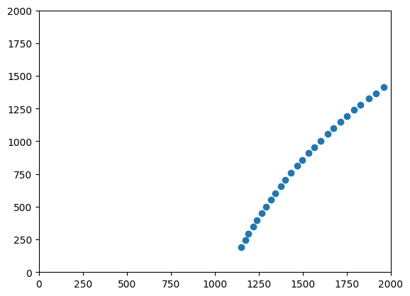
This made sense, and still seemed sensible given the encoder/left right data above. What about multiple poses over time?
fig, ax = plt.subplots()

for pose_index in range(poses_over_time.shape[1]):
    ax.scatter(poses_over_time[:, pose_index, 0], poses_over_time[:, pose_index, 1])
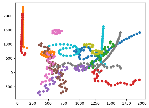
This makes no sense, it matches what I saw - with little circles. But all the poses should have had the same motion data. What does that motion data look like? The translation data should have the robot moving forward in whatever heading it is at (this is from the first dataset):
fig, ax = plt.subplots()
ax.plot(np.arange(len(data)), data[:, 6])
ax.legend(["overall speed"])
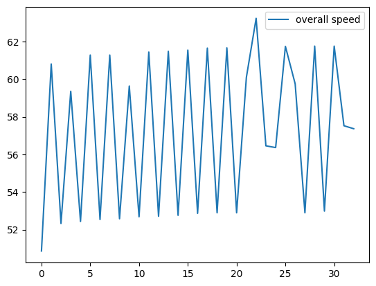
So there’s a consistent forward speed (the robot was mostly driving forward), the variation is likely due to timing (multiple routines are in play, these are not consistent time ticks) but it’s overall 60 units per update. Those little rings didn’t appear to have much forward motion in them.
What about the rotation? I don’t expect much due to the robot mostly moving forward. Since we got rings, graphing the cumulative sum of the rotations seemed like a useful output:
cumulative_rotation = np.cumsum(data[:, 5] + data[:, 7])
fig, ax = plt.subplots()
ax.plot(np.arange(len(cumulative_rotation)), cumulative_rotation)
ax.legend(["cumulative rotation"])
This gave a fairly dull graph, with a full rotation of around -25 degrees (let’s say we don’t 100% trust it):
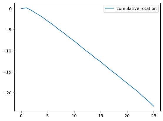
This also doesn’t make for little rings. So the motion data doesn’t currently hold with what all the poses are doing.
I will continue to investigate, but my guess so far is that when I’m applying the motion data to the poses, something is changing in that data across the range of poses.
Update
After digging throughout the day, I was able to isolate the problem I had to being a bug in ulab and raise this with CircuitPython.
Robotics at Home with Raspberry Pi Pico
This post was based on research I did for the book Robotics at Home with Raspberry Pi Pico which is available now.